Who Was Remembered: a desert of 576,000 books
Who Was Remembered is a browser-based 3D art piece: a desert scattered with 576,000 books, one per English Wikipedia article about a historical figure. You start at the year 2000 and walk outward, back in time, as the books thin out around you. It runs in the browser on desktop and mobile, and is also on itch.io. Idea to launch took two weeks. I drove the design and every decision documented here; Claude Code wrote substantial portions of the pipeline and runtime under that direction.
Who Was Remembered grew out of a conversation about a different project. In late May I found xikipedia, a Twitter-style feed for Simple Wikipedia, and brought it to Claude to talk through a possible fork. Somewhere in that conversation a different idea took over. What if you could walk through Wikipedia instead of scrolling it? A desert scattered with monuments to real people, placed so that era and geography read as terrain. Fourteen days later it was live.
The finished piece is built from two halves. A Python pipeline streams the Wikidata and Wikipedia dumps (about 120 GB compressed between them) down to a placed, walkable world: which figures survive, where each book sits, where the teleporter monuments stand, what shape the dunes are. A Three.js runtime loads those baked artifacts and renders the desert. Players only ever touch the runtime; the pipeline runs offline on my machine. This post is about the decisions in between, most of which reduce to one rule: the dataset’s bias is the subject, so every impulse to correct, smooth, or fill it in has to be interrogated before it ships.
Time is radius, and every century gets equal width
The corpus has roughly 100 times more figures per century in the modern era than in antiquity. The first placement question was what to do about that.
Radius is time. You spawn at the rim of an empty central plaza that stands for the present, and walking outward walks you into the past, 2,800 years of it to the world’s edge. The tempting mapping is one that equalizes spacing, compressing the sparse ancient centuries into a thin ring so the world feels uniformly populated. I rejected it because the compression lies. It implies the deep past is as well documented as the 20th century, which is precisely the impression the piece exists to refute. Instead the mapping is linear, every century gets the same radial width, and the handful of ancient figures sit in vast, nearly empty rings where the emptiness reads as what it is, the missing record.
I never picked the world’s size, either. Given linear time, I computed nearest-neighbour book spacing per era band and looked for the smallest world where the bulk modern band keeps about a one-second walk between books. That world has a radius of about 7,100 units, an 80-minute walk from the present to the edge of antiquity. The spawn decade deliberately stays an overlapping thicket, a wall of the recently dead piled too dense to spread, which is the strongest opening image of recency bias the data could give me. Deep time is unwalkable by design. Holding Shift lets you skate across the dunes at speed, a necessary affordance when the distances between known figures become vast.
The fairness correction that lied
The other axis, the angle around the disc, is geography. Each figure sits at the angle of its longitude, mapped straight onto the circle. Before settling on that I took a detour that became the most instructive mistake of the project.
Early analysis of the corpus showed that longitude is itself a fame axis. Fame in this dataset concentrates in Western Europe, which is a narrow longitude band, so recognizable figures were about twenty times more angularly concentrated than their same-era peers. The famous all crowd into one thin wedge of the disc. The obvious fix was a population-weighted remapping that allocates angular width by how many figures live at each longitude, so every direction of the disc holds a comparable population. I built it and baked it.
Then I measured what it actually did. Because the corpus is overwhelmingly Anglo-American, allocating width by population handed the USA alone about 110 degrees of the disc and the West as a whole roughly 270, three quarters of the whole landscape, while Russia, the Middle East, India, China, Japan, and Africa were crushed into the remainder. In deep time it was actively dishonest. The recorded ancient world is mostly non-Western, so antiquity got squeezed into a sliver where a single 15-degree sector spanned Egypt to China. The correction hadn’t removed the Western bias. It had relocated it from radial density to angular width, made it illegible, and started lying about the one era it should have served best.
So I reversed it. Angle is raw longitude, and geography is literally true everywhere on the disc. The corpus’s skew now shows up as honest density, an over-full Anglo-European wedge while the rest of the world stays sparse even in the modern ring. That skew is the subject of the piece rendered in the data rather than hidden by a transform. A partial blend of the two mappings was considered and rejected on the same grounds; it would have quietly distorted the thing the piece is about. The empty directions are real too. Ocean longitudes and under-recorded regions stay dark, and the pre-Columbian Americas simply vanish as you walk into the past, because in this kind of record, they do.
What gets a book
Recognizable figures matter in a piece like this. They are points of reference. When you find an unknown figure lying a step from someone you have heard of, the famous neighbour tells you when and where you are, and the unknown gains a context. But recognition could not be allowed to become a gatekeeper. Ordinary people belong here, and a desert where only the famous survive would amputate the very texture the piece exists to show.
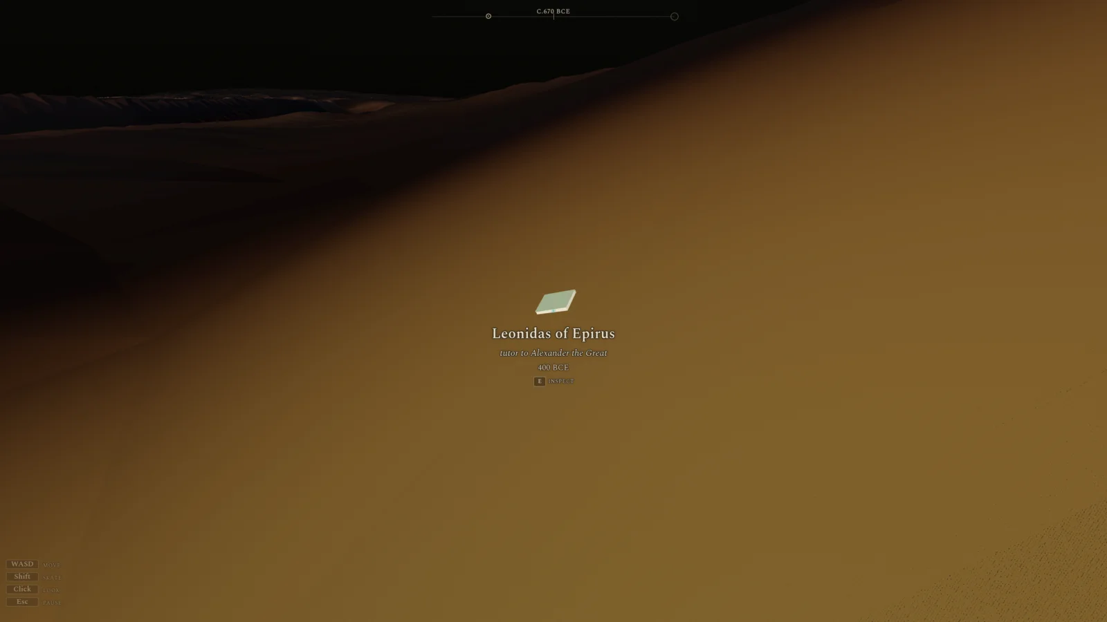
Article quality is the gatekeeper instead. If a player keeps opening books and they keep turning out to be one-fact stubs, they will get bored and stop opening books at all, so a filter had to protect the experience of reading. The first version of that filter gated on the shape of the article’s lead, at least two sentences and thirty words, mostly because the lead was what the pipeline already extracted. I had not had the foresight to capture the full article text. Atahualpa proved the approach wrong. His article runs over 4,000 words behind a single dense lead sentence, and the rule cut him, along with a wall of Nobel physicists. So we rebuilt the extraction stage to capture real article word counts and gate on those, with the floor set low, 100 words, to scrub out the one-fact stubs while keeping minimal but real biographies. There turned out to be far fewer stubs than I had feared. Of the 638,000 figures who died before the year 2000 (where the piece stops, to keep contested contemporary politics out of it), 576,000 cleared the gate.
Placing the placeless
About a quarter of the corpus has no recorded birth or death place, and what to do with those figures was a test of the same principle from a different angle. The resolution ladder reads only recorded data: a citizenship if there is one, then a hand-curated gazetteer matched against the English description (“ancient Greek physician”, “German nobleman”). The load-bearing trick is that a resolved country never becomes a centroid. Collapsing 15,000 placeless Americans onto one longitude would draw a hard national spoke across the disc, so each figure instead borrows the longitude of a randomly sampled compatriot who does have coordinates, and the placeless spread across their country’s real arc, statistically indistinguishable from the anchored population.
I considered inferring citizenship from name embeddings for the rest and declined. A name predicts ethnolinguistic origin rather than citizenship, it fails hardest on the anglophone majority it would most need to split, and philosophically it fabricates the very data whose absence the piece is about. The final 4 percent are genuinely placeless in the record. They keep a deterministic random angle and render washed-out and grey, visibly adrift.
Fame never moves a book
The piece doesn’t pretend fame away either. Recognizable figures get taller, brighter books, landmarks to steer by, and that is the only thing prominence is allowed to do. It never moves a book.
Even that navigation layer needed bias work. Ranking by link-graph centrality was rejected after testing. PageRank over the article graph massively favours political rulers, since every biography dates itself by the regime its subject lived under, and monarchs accrue links until George V outranks Einstein. It also skews more Anglo-American than the alternative. The shipped signal is sitelink count, the number of language editions that carry the article, which is cross-lingual and closer to plain recognition. It feeds two sources. A global floor makes anyone recognizable enough a landmark wherever they sit, about 1,600 figures. A local fill then promotes the best-covered figure in any region-and-era cell that has no global landmark, which is how Moctezuma II and the early-dynasty pharaohs become reference points in directions the global floor never reaches.
Article length is in the books too, but quietly. A longer article makes a thicker book, the way longer books are thicker in real life, while every book keeps roughly the same footprint on the sand, because in the dense modern wedge there is no ground to spare.
The world is large enough that fast travel earned its place. Twenty-six teleporter monuments jump you between hand-curated corners of history, so visiting pharaonic Egypt doesn’t demand an hour of travel. Each anchor is defined as a list of people rather than a coordinate. The Italian Renaissance is Leonardo, Michelangelo, Raphael, Machiavelli, Galileo, and Botticelli, and the monument stands wherever the placement actually put those six, so re-baking the world moves the network with it. Because angle is longitude, an anchor only works if its people landed near each other, and the pipeline fails the bake if an anchor’s members scatter wider than 40 degrees. World War II can never be a monument. Its figures span the planet and their centroid is dead space, so spread themes split by place instead, like Abbasid Baghdad and Moorish Iberia.
The edge of what we know
The last placement problem was the world’s edge. Everything before 800 BCE clips to the outermost radius, which initially rendered as a crisp artificial circle, a wall at the end of time. The wall also stacked figures who lived enormous spans apart into the same ring. A Bronze Age bog body and an early-dynasty pharaoh could end up shoulder to shoulder, reading as contemporaries when they were separated by well over a thousand years.
The fix was not to extend the timeline. Most deep-past dates are estimates, and a death year snapped to a round century or millennium is the record admitting it doesn’t know, so giving those figures a precise radius would claim a precision that isn’t there. Radius scatters with date uncertainty instead, scored from exactly that roundness. Modern placement is untouched, and the rim dissolves from a hard ring into a diffuse frontier some 300 units deep. Back there the world itself goes vague, because back there we don’t know when.
Shipping it
The piece runs on phones, which it owes to its rendering architecture. Books beyond walking distance are drawn as a point cloud of impostor sprites rather than full meshes, with a minimum on-screen size so that even a lone record on the BCE horizon never shrinks below visibility. Reworking a renderer this stateful without breaking it also needed a safety net, so the project grew a golden-image harness: seven pinned camera poses rendered deterministically and diffed pixel by pixel against approved reference shots after every change. Both deserve their own post.
Who Was Remembered is playable at wwr.simonsorkin.com and on itch.io; the pipeline and runtime are on GitHub under MIT. Walk outward. It gets quiet fast, and that quiet is the point.